ABC Billing
| Metric Name | Listed Under Display Item | Information Source(s): | Description |
Views |
|---|---|---|---|---|
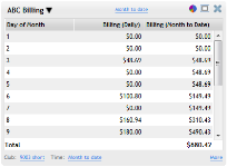
| ABC Billing | Sales | The ABC Billing metric displays the total amounts collected via ABC, and compares this data to the configured goals. | Total Collected by Club and Date |
Columns in this metric
- Day of Month: The date of the selected month.
- Billing (Daily): The amount collected via ABC billing on this date.
- Billing (Month to Date): The total amount collected via ABC billing in the viewed month to date.
Metric Options
To configure options, hover the cursor over the metric title.
Select Configure Options from the drop-down menu.
These options are as follows:
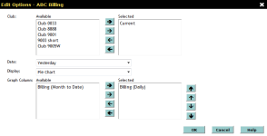
Club: Select the club(s) you want to display. Show me how to use the multi-select list.
Date: Select the date range you want to display.
- Yesterday
- This Week
- Last Week
- Last 7 Days
- This Month
- This Month (Month to Date)
- This Month (Mid Month)
- Last Month
- Last Month (Month to Date)
- Last Month (Mid Month)
- This Month Last Year
- This Month Last Year (Month to Date)
- Custom - This option allows you to select a custom date range in the date fields to the right (See Using Custom Date Ranges).
This metric has a maximum date range of 31 days.
Display: The data in the ABC Billing metric can be displayed the following ways:
- Table: The table display is the default for this metric, and will show all information selected in this metric.
- Pie Chart: This sections of this pie chart are color-coded to the dates that appear.
The chart will vary depending on which columns are selected (see Graph Columns below).
Hover the cursor over each section to see more information about this item.Note: Only positive numbers can be displayed in the pie chart.
- Line Graph: The lines of this graph are color-coded to the selected graph columns (see Graph Columns below).
Hover the cursor over each line to see more information about this item.
The display can be also be toggled by clicking the display icon in the metric toolbar:
-
 Switch to Table Display (Appears when using the Line Graph Display)
 -
 Switch to Pie Chart Display (Appears when using the Table Display)
 -
 Switch to Line Graph Display (Appears when using the Pie Chart Display)
Graph Column: Select one or both of the items that you want to display in the pie chart and line graph using the multi-select list (See Multi-Select List):
- Billing (Daily): The amount collected via ABC billing on this date.
- Billing (Month to Date): The total amount collected via ABC billing in the viewed month to date.
After making your changes in the Edit Options Menu, click OK to save the configuration.
- When a large amount of data appears in this metric, sort by the Billing (Daily) and Billing (Month to Date) columns to see the largest count and percentage in each category. See Sorting Columns.
- When using the pie chart display, you may want to select only one graph column in the Options menu to avoid confusion.
 © 2024 ABC Fitness Solutions, LLC.

