Check Ins
| Metric Name: | Listed under Display Item: | Information Source(s): | Description: | Views |
|---|---|---|---|---|
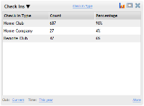
| Check Ins | Member | Check In Display | The Check Ins metric displays information about check ins over the selected date range. |
|
Note: Check Ins that are deleted on any day other than the day they were created will not be deleted from the Check Ins metric display. Check Ins data is sent to the data warehouse nightly, and changes made to check in data from a previous day will not be altered. For this reason, there may be discrepancies between the information displayed on the Check Ins metric and the Check Ins report.
Columns in this metric
- View: The first column displays the selected View. See Check In Metric Views below.
- Count: The number of check ins at this time or in this category.
Note: In the Alert Type View, each alert will be displayed as a separate check in. - Percentage: The percentage of check ins in this row of the total displayed.
Metric Options
To configure options, hover the cursor over the metric title.
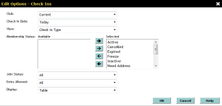
Select Configure Options from the drop-down menu.
These options are as follows:
Club: Choose the club you want to display. This metric only displays one club at a time.
Check In Date: Select a check in date range to display.
- Today
- Yesterday
- This Week
- Last Week
- This Month
- This Month (Month to Date)
- This Month (Mid Month)
- Last Month
- Last Month (Month to Date)
- Last Month
- This Month Last Year
- This Month Last Year (Month to Date)
- This Year
- Last Year
- Custom - This option allows you to select a custom date range in the date fields to the right (See Using Custom Date Ranges).
This metric has a maximum date range of 366 days.
- Check In Type: Groups check ins into Home Club, Home Company (other clubs belonging to the same company), and Remote Club.
- Alert Type: Groups check ins according to alert type, configured on the Manage Alert Types page in DataTrak.
- Membership Type: Groups check ins according to the member's membership type.
- Day of Week: Groups check ins by the day of the week on which the check ins occurred.
- Day of Month: Groups check ins by the day of the month on which the check ins occurred.
- Hour of Day: Group check ins by the hour of the day at which the check ins occurred.
Membership Status: Choose the membership states of the check ins you want to display or select All.
Join Status: Display member check ins, prospect check ins, or both (All).
Entry Allowed: Display check ins by Entry Allowed, Entry Denied, Unattended Entry, Normal Entry, or All.
Display: This metric can be displayed in the following ways:
- Bar Graph: The bars in the graph display the check in counts grouped according to the selected View. Hover the cursor over the bars on the bar graph to see more information.
- Pie Chart: The sections of the pie chart represent check in counts grouped according to the selected View. Hover the cursor over the sections of the pie chart to see more information.
- Line Graph: The line graph shows check in counts, with the x-axis labeled as the groups set by the selected View. Hover the cursor over the points of the line to display more information.
- Stepped Area Chart: The areas of the stepped area chart represent check in counts grouped according to the selected View. Hover the cursor over the areas to see more information.
- Table: This is the default display for this metric, and will display all the information selected in the Options menu.
The display can be also be toggled by clicking the display icon in the metric toolbar:
-
 Switch to Table Display (Appears when using the Stepped Area Chart Display)
 -
 Switch to Pie Chart Display (Appears when using the Bar Graph Display)
 -
 Switch to Line Graph Display (Appears when using the Pie Chart Display)
 -
 Switch to Bar Graph Display (Appears when using the Table Display)
 -
 Switch to Stepped Area Display (Appears when using the Line Graph Display)
After making your changes in the Edit Options Menu, click OK to save the configuration.
- When a large amount of data appears in this metric, sort by the Count and Percentage columns to see the largest count and percentage in each category. See Sorting Columns.
- The Alert Type View will display each alert as a separate check in. Because more than one alert may be associated with a member check in, the Alert Type View may show more check ins than the other displays. See an example of this comparison.
 © 2024 ABC Fitness Solutions, LLC.

