Rebound Reporting
The Rebound Reporting tab provides two dashboards with accessible, relevant, and easy-to-understand data to help minimize long-term impacts from COVID-19. The following are the available dashboards.
These dashboards can help you to preserve 2020 revenue streams in order to make sound business decisions that promote growth in restrictive and uncertain conditions.
Selection Criteria
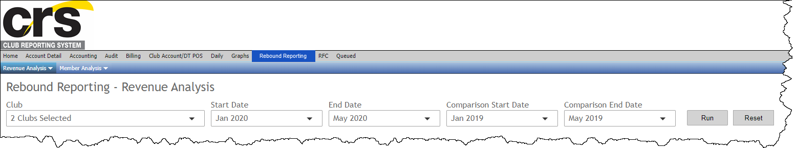
Select a dashboard and then use the following selection criteria to indicate which clubs and time periods you would like to view.
- Club – You can select one or more clubs to view using a multi-select list box. Click the Select All check box to include all clubs.
- Start Date and End Date – You can select a month over month date range in 2020 to view.
- Comparison Start Date and Comparison End Date – You can select a month over month comparison period in 2019 to view.
- Run – Generates the dashboard for the selected clubs and months.
- Reset – Returns all dates to the default setting (start dates of Jan-May 2020 compared to Jan-Dec 2019), but maintains the club selection.
An example of the selection criteria is shown below.
The Revenue Analysis and Member Analysis dashboards are described below.
Revenue Analysis Dashboard
The Revenue Analysis dashboard allows you to compare revenue data from a starting time frame in 2020 with data from the selected comparison time period in 2019.
The reported revenue matches the collected amounts, including tax, on the Daily Revenue and Deposit Reconciliation report.
The dashboard provides the following information.
| Title | Type | Description |
|---|---|---|
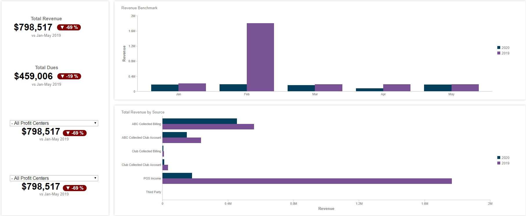
| Total Revenue | KPI | Displays the total revenue during the selected time period compared to the same time period in 2019. |
| Total Dues | KPI | Displays the total revenue from membership dues during the selected time period compared to the same time period in 2019. |
| Revenue by Profit Center | KPI | Displays the total revenue from the selected profit center for the selected time period compared to the same time period in 2019. |
| Revenue Benchmark | Column Chart | Displays the total revenue per month for the selected time period in 2020 versus a selected comparison period in 2019. |
| Total Revenue by Source | Bar Chart | Displays the total revenue broken down by source in the selected time period versus a selected comparison period in 2019. |
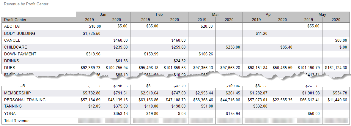
| Revenue by Profit Center | Grid | Displays the total revenue broken down by profit center in the selected time period versus a selected comparison period in 2019. |
The following are examples of the Revenue Analysis dashboard information.
Total Revenue, Profit Centers, Revenue Benchmark, Total Revenue by Source
The top section of the report displays the total revenue, total revenue from membership dues, total revenue by profit center, as well as a revenue benchmark and total revenue by source. An example of the top section of the dashboard is shown below.
Revenue by Profit Center
The Revenue by Profit Center section displays the total revenue broken down by profit center in the selected time period versus a selected comparison period in 2019. An example of the Revenue by Profit Center section is shown below.
Member Analysis Dashboard
The Member Analysis dashboard allows you to compare member data from a starting time frame in 2020 with data from the selected comparison time period in 2019. The dashboard provides the following information.
| Title | Type | Description |
|---|---|---|
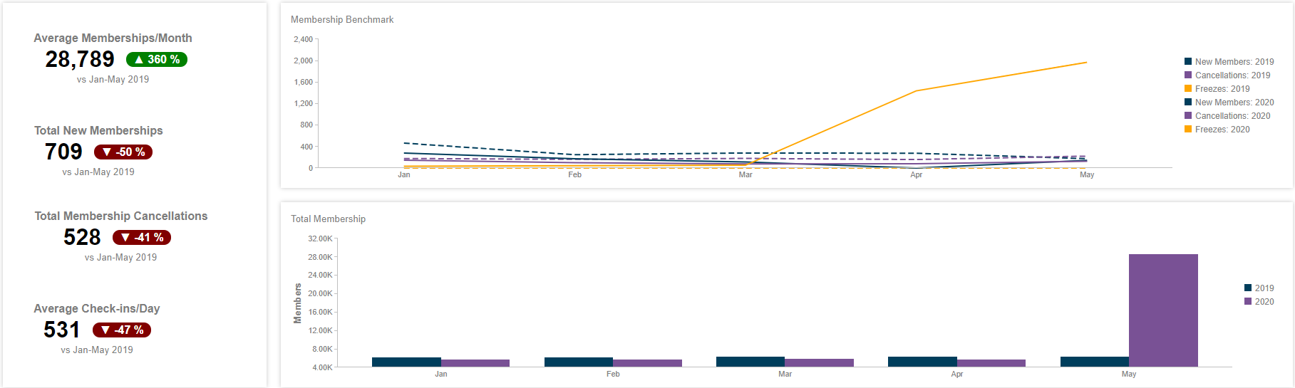
| Total New Memberships | KPI | Displays the total number of new members during the selected time period compared to the same time period in 2019. |
| Total Membership Cancellations | KPI | Displays the total number of cancellations during the selected time period compared to the same period in 2019. |
| Membership Benchmark | Line Chart | Displays the total new members, cancellations, and freezes per month for the selected time period versus a selected comparison period in 2019. |
| Total Membership | Column Chart | Displays the total number of members per month for the selected time period in 2020 versus a selected comparison period in 2019. |
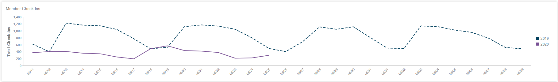
| Member Check-ins | Line Chart | Displays the total member check-ins per day for the previous 15 days versus the same period in 2019. |
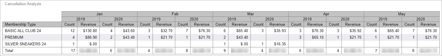
| Cancellation Analysis | Grid | Displays the total number of cancellations and the billing value of those cancellations per month for the selected time period in 2020 versus a selected comparison period in 2019. |
The following are examples of the Member Analysis dashboard information.
New Members, Cancellations, Check-ins, Membership Benchmark, and Total Membership
The top section of the report provides totals for new members, cancellations, and check-ins. It also provides a Membership Benchmark line chart and a Total Membership bar chart. An example of this information is shown below.
Member Check-ins
The Member Check-ins section displays the total member check-ins per day for the previous 15 days versus a selected comparison period in 2019. The data is represented in a line chart as shown below.
Cancellation Analysis
The Cancellation Analysis section displays the total number of cancellations and the billing value of those cancellations per month for the time period selected by the user in 2020 versus a selected comparison period in 2019.