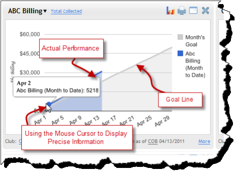
Line Graphs
On line graphs, Dashboard shows a bolder, blue line to represent actual performance and a fainter, gray line to represent the goal. Move your mouse over the graph to see precise information for a data point.
The following image shows an example of a graph where the club is exceeding its goal:
![]() © 2024 ABC Fitness Solutions, LLC.
© 2024 ABC Fitness Solutions, LLC.